
Why Your Donation Page is Losing Donors (and 3 Fixes)
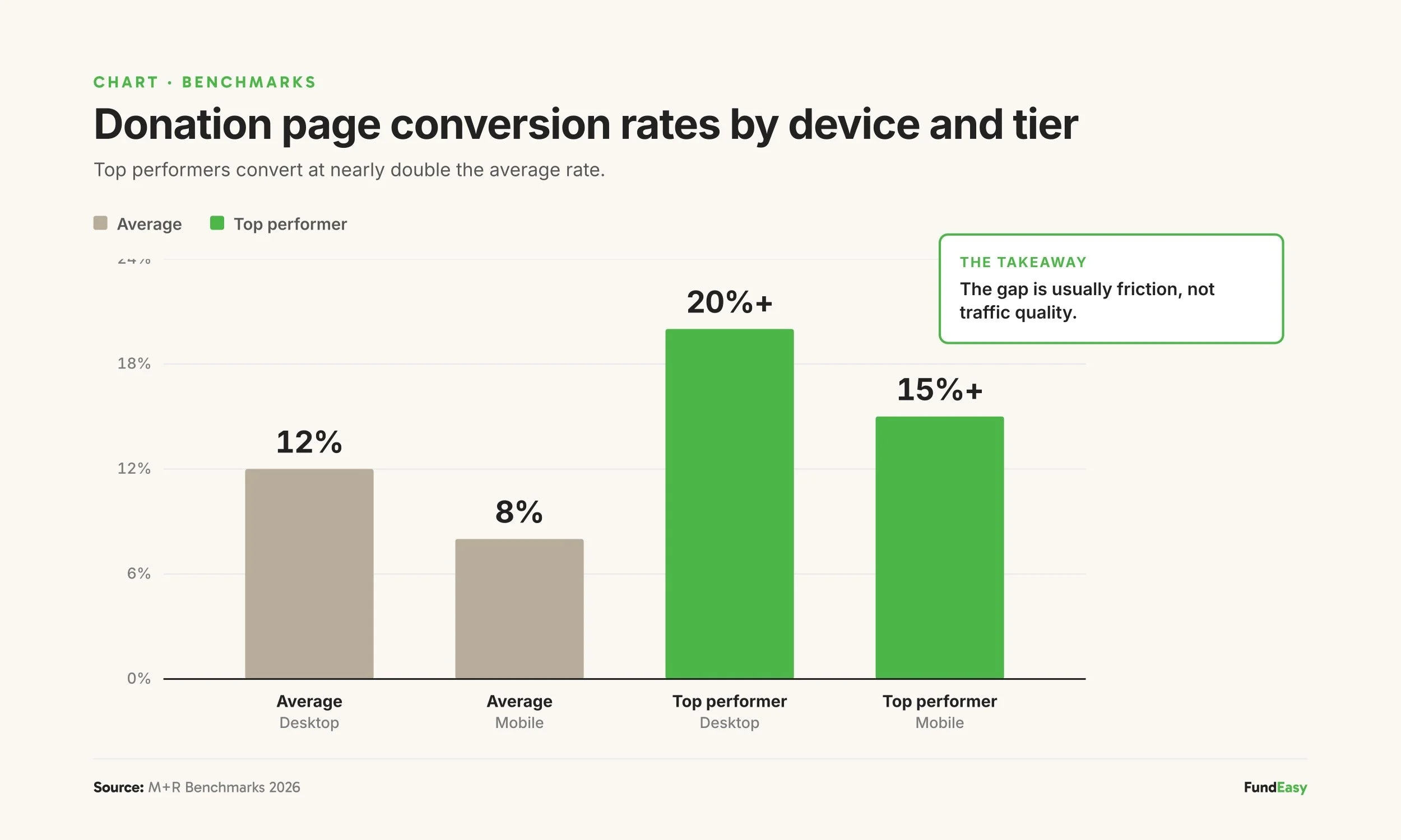
Most nonprofit donation pages convert at around 12% on desktop and 8% on mobile, according to the M+R Benchmarks 2026 study. That means roughly 9 out of 10 visitors who land on a donation page leave without giving. Three specific friction points cause most of that loss: forced account creation, suggested donation amounts that don't match your typical donor, and a hidden or missing monthly giving option. Each one is fixable, and together they often represent the difference between an underperforming donation page and one that converts at industry-leading rates.
For a nonprofit raising $100,000 a year online, improving conversion from 8% to 10% on a mobile page generates roughly $25,000 in additional annual revenue at the same traffic level. No new ad spend, no new email list, no new campaign. Just removing friction from the page donors already see.
The good news: the fixes are largely platform decisions, not design problems. Most of the work happens before a donor ever sees the page.
What's a "good" donation page conversion rate?
Industry benchmarks for nonprofit donation page conversion sit in the 10-15% range on desktop and 7-10% on mobile, per M+R Benchmarks 2026. The highest-performing nonprofits hit 20%+ conversion on desktop, often because they've spent years removing friction from the donor flow.
A few things to know about these benchmarks:
Mobile typically converts 30-40% lower than desktop. This is a universal pattern across the sector, driven by smaller screens, slower load times, and friction with mobile keyboards. Mobile-first design narrows the gap.
Conversion varies by traffic source. Email traffic typically converts at 3-5x the rate of social or paid traffic, because email recipients are usually existing supporters.
A "low" conversion rate isn't always the page's fault. If most of your traffic comes from cold sources, even a perfect page will look like it underperforms.
That said, the three friction points below affect every donation page regardless of traffic source. Fixing them moves the rate up across the board.
Killer #1: Forced account creation
The single fastest way to drop donation page conversion is requiring donors to create an account before they can give.
The logic seems reasonable from inside the organization: "We want to track this donor, send them future communications, link this donation to their history." But from the donor's perspective, the ask looks like this:
I came here to give you money.
Now you're asking me to create another login and password I'll forget.
I'll do this later.
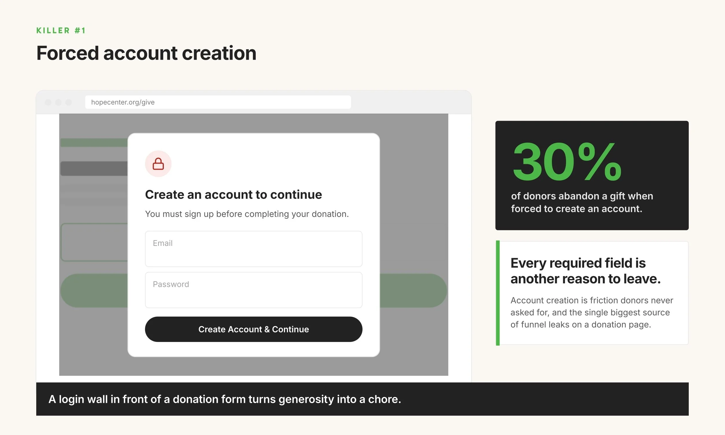
Donation completion drops significantly when account creation is required. Most modern donation flows skip the account step entirely and collect contact information as part of the donation form. Donor records get created automatically on the back end. The donor never feels like they're "signing up."
The fix: Audit your current donation flow. If a donor has to create an account, set a password, or verify an email before completing a donation, that step should be removed. If the platform won't let you remove it, the platform is the problem.
Killer #2: Suggested amounts that don't match your donors
Three preset amounts on a donation page either work for your donors or they don't. A small grassroots nonprofit with suggested amounts of $100 / $250 / $500 is asking far above what their typical donor gives — most donors won't pick any of those. A major-gifts campaign with $25 / $50 / $100 leaves significant money on the table from donors who would have given more if asked.
This is a quieter conversion killer than forced account creation, but it shows up across donation pages more often than most nonprofits realize. The fundamentals of a well-tuned donor flow:
Suggested amounts that reflect your actual donor base. The right defaults vary widely. Grassroots advocacy might use $10 / $25 / $50. General operating support might use $25 / $50 / $100. Faith-based and mission-driven causes often work with $25 / $100 / $250. Major-gifts campaigns might use $250 / $500 / $1,000. You can pull from your own donation history, these numbers should bracket the most common gift sizes your donors actually give.
A fee-cover checkbox. M+R Benchmarks 2026 reports that around 60% of donors opt to cover the processing fee when asked. Without the option, the nonprofit absorbs the cost.
One-time and monthly both clearly visible in the same flow (covered in detail as Killer #3 below).

Each is small on its own. Together, they're the difference between a page tuned to your donors and a page running on generic defaults that don't reflect who's actually giving.
The fix: Look at your last 100 donations. What's the most common gift size? What's the average? Make sure your three suggested amounts bracket those numbers. If your current platform doesn't let you customize the suggested amounts, that's worth fixing.
Killer #3: A hidden or missing monthly giving option
If your donation page makes monthly giving harder than one-time giving — even slightly — the monthly opt-in rate craters.
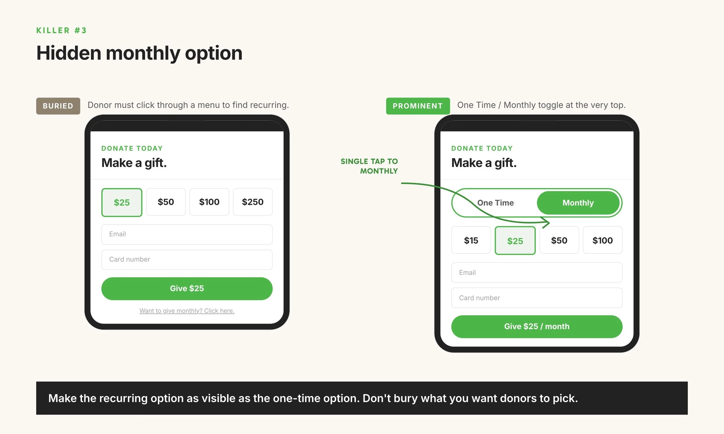
M+R Benchmarks 2026 found that 64% of nonprofits default their donation pages to one-time gifts, and most see monthly opt-in rates in the single digits to low double digits. The nonprofits that default to monthly (most prominently Public Media organizations) see 86% of donors choose the monthly option and pull 61% of total online revenue from recurring donors.
The design pattern that produces the highest monthly opt-in rates is dead simple: a "One Time" and "Monthly" toggle, both visible at the top of the donation form, both equally easy to tap. No extra steps. No "click here for monthly options." No separate form.
The fix: Open your donation page on your phone. Can you set up a monthly donation in the same number of taps as a one-time donation? If monthly takes one more tap, one more screen, or one more field, that gap is costing you sustainers.
Other common conversion killers
Beyond the big three, a few additional issues affect donation page completion:
Slow mobile load time. Every additional second of load time drops conversion. Aim for under 3 seconds on mobile. Most platforms publish their average load time in their documentation; if yours doesn't, that's a red flag.
No option to cover processing fees. When donors aren't given the option to cover the 2.9% + $0.30 processing fee, nonprofits absorb the cost. M+R Benchmarks 2026 reports that around 60% of donors opt to cover when asked. That's free margin you're leaving on the table.
Card-only payment. Donors increasingly expect to pay with bank transfer (ACH), Apple Pay, Google Pay, or PayPal in addition to credit cards. Card-only flows lose donors who don't want to enter card numbers on mobile.
Long forms. Every required field drops completion. Ask for the minimum needed (name, email, donation amount, payment method) and make everything else optional.
No mobile-optimized layout. A donation form that requires pinching to zoom on a phone is going to lose most of its mobile traffic. Mobile-first design is now the baseline.
How to audit your donation page in 10 minutes
Five-step audit you can run today:
Pull your donation page up on your phone. Not a tablet, not a desktop. Your phone. Walk through giving $25 as a one-time gift.
Walk through giving $25 monthly. Count the taps. If it's more than one extra tap than the one-time flow, you have a fix to make.
Note any account-creation, login, or password steps. Each one is a conversion killer.
Check your suggested amounts against your donation history. Pull up your last 100 donations and find the most common gift size and the average. Do your three suggested amounts bracket those numbers? Also try covering the processing fee — can you?
Time the page load. Most browsers have a "performance" tab that shows page load metrics.
This audit takes 10 minutes and surfaces the friction points that are quietly costing you donors every day.
Frequently asked questions
What is a good donation page conversion rate for a nonprofit?
Industry benchmarks sit at 10-15% on desktop and 7-10% on mobile, according to M+R Benchmarks 2026. Top-performing nonprofits hit 20%+ on desktop, often because they've removed friction from the donor flow over years of iteration.
Why is my mobile donation rate lower than desktop?
Mobile typically converts 30-40% lower than desktop across the nonprofit sector. The main causes are smaller screens making forms harder to read, slower load times, friction with mobile keyboards, and donation flows that weren't designed mobile-first. The gap narrows with mobile-optimized design and shorter forms.
Should I make donors create an account to donate?
No. Required account creation is one of the largest conversion killers in donation flows. Modern platforms create donor records automatically on the back end without requiring the donor to set up a login or password. If your current platform forces account creation, that's worth fixing.
What suggested donation amounts should I use?
Suggested amounts should reflect your typical donor's gift size. Pull data from your last 100 donations and find the most common gift size and the average. Your three suggested amounts should bracket those numbers. A grassroots nonprofit might use $10/$25/$50; a general operating campaign might use $25/$50/$100; a major-gifts campaign might use $250/$500/$1,000. Generic defaults that don't reflect your actual donor base drop conversion in both directions — too high and donors won't pick any, too low and donors give less than they would have.
How much do processing fees cost?
Most processors charge around 2.9% + $0.30 per transaction. Nonprofits typically qualify for discounted rates (Stripe offers 2.2% + $0.30 for verified nonprofits). Plus, whatever platform you are using will usually have a fee on top of that to cover their costs, usually between 4-6%. When donors are offered the option to cover the processing fees, around 60% opt in, according to M+R Benchmarks 2026.
How quickly should a donation page load?
Aim for under 3 seconds on mobile. Conversion drops measurably with every additional second of load time. Most modern fundraising platforms publish page load benchmarks; if your current platform doesn't share that data, ask.
A donation page built for completion
The fastest way to improve donation page conversion is starting with a platform built around the patterns above: no account creation, monthly visible in the same flow, mobile-optimized donor experience, processing fee opt-in built in.
FundEasy is built on these defaults. Every hosted giving page lets nonprofits set their own three suggested amounts so they match the cause and the donor base — $10/$25/$50 for grassroots, $250/$500/$1,000 for major gifts, or whatever bracket reflects your actual donors. The monthly toggle sits in the donor flow above the fold. Donor accounts aren't required to give, and an optional fee-cover checkbox is built in. Nonprofits can also customize the headline, mission statement, accent color, and button text so the page reflects the cause. Mobile and desktop run the same donor flow.
For nonprofits whose current donation page is losing more donors than they realize, the audit above will surface the problem. The fix often involves either changing the platform or pressing the current platform to update the donor flow.
